
-
Announcement
Welcome to the forums!
If you are a newly-approved member, make sure you check out the New Member Checklist!
If you are a Detachment member and can't see the member-only area, post here for access.
-DV

Koda Vonnor
-
Posts
334 -
Joined
-
Last visited
-
Days Won
1
Content Type
Profiles
Forums
Gallery
Events
Everything posted by Koda Vonnor
-
The choice to overlook details is entirely up to the costume creator. Entirely. The acceptable way to point out the details is entirely up to the forum moderators. One of the things I have always enjoyed and appreciated about the Flagship Eclipse is the community's overwhelming propensity toward focusing on the details of the costumes without meaning anything (or taking anything) personally. That quality sets it apart from most of the other costuming sites. Every one of you in here are off-the-scale detail oriented and accurate. You are all at the top end of the craft. To reproduce such things as you do from scratch is a marvelous and praiseworthy endeavor. You should all be very proud of that. I can speak only for myself, but having you all as critics on the details and accuracies/inaccuracies of my work is both welcomed and appreciated. Extra sets of professional eyes can only lead to a better end-product. I myself am well aware of several inaccurate details on my latest project, but sometimes generating the means and motivation to make accuracy adjustments is more difficult than knowing what needs adjusting. This is a great community, guys. I don't think anybody means anything personal. We speak to the costumes, not to the costumers. ~ Bill Costigan
-
Colors are looking good. Throw a bunch more dark dirt on the wraps and you got it dead-on.
-
Congratulations on first place in the Rebel Scum tenth annual Halloween costume contest. http://www.rebelscum.com/scary10b.asp And a nod to the Maestro for presenting Darth Bane. http://www.rebelscum.com/halloween/2008/image78.asp ~ Vonnor
-
The overall look & feel, and the weathering are the best I've seen so far. The blaster burn around the restraining bolt, and the angle of the collar on the shoulder armor indicate a great eye for detail. Well done. ~ BC
-
Standards Discussion - TIE Fighter Factory/Training Gear
Koda Vonnor replied to a topic in Starkiller
There are some better (more square-looking) side release buckkle sources out there, if you google "side release buckle." I'll check later from work when I get time and post some here. -
Thanks you guys!
-
For the buckles... I saw a couple screen shots from the actual game that did not show a black "side-release" plastic buckle on the 3" belt. It only showed one of those funky looking metal clips (adjustment sliders?) in the back. Were I doing this costume, I'd probably get or cut the 3" (7cm) strap then take measurements and sketch up some kind of mock slider that would be stitched or riveted to the strap from the back. Then I'd have my metal fab guy make a couple from aluminum. For both the 7cm size and the smaller one. I certainly wouldn't let a lack of 3" side-release buckles be a show stopper for this costume. I might even look into sculpting the two halves of the buckle and doing semi-rigid smooth-on resin castings, if that bigass buckle becomes an issue.
-
Who's gonna see it, for god's sake? I think you're the only one I've seen actually recreate the A'Besh lettering anyway. It's very cool.
-
I notice you substituted a "D" for the "Y" in the readout. Was there another reference pic that showed it that way? Great weathering. ~ BC
-
Standards Discussion - TIE Fighter Factory/Training Gear
Koda Vonnor replied to a topic in Starkiller
Ah that was my mistake then. I searched and researched the Aurebesh font (mainly because Mister Google assumed I meant "Aurebesh" when I typed in "Aurabesh" - I have gotten so used to taking Mr. Google's advice on such things, I never looked at the results of the first search), and only found either the "braile" dot-bar numerals, or numbers that were identical to Arabic numerals. I stand corrected. My apologies to Steve S. for any inferred (and I assure unintentional) castigation. Order 67. Cute. ~ BC -
Standards Discussion - TIE Fighter Factory/Training Gear
Koda Vonnor replied to a topic in Starkiller
Speculation: If it is Aurebesh, it is not "67." Speculation: If it is "67," it is not Aurebesh. (The rest of the display is Aurebesh.) Evidence: (Screenshot of "Newaure.ttf" font in MS Word 2007. Newaure 180pt, Verdana 72pt) ~ Vonnor -
Standards Discussion - TIE Fighter Factory/Training Gear
Koda Vonnor replied to a topic in Starkiller
It says: ORDER ?? (2 unknown characters) SEARCH DESTORY (gotta believe it's a typo for "DESTROY") and in the bottom right: KOTA (not sure if I should be honored or scared) -
Standards Discussion - TIE Fighter Factory/Training Gear
Koda Vonnor replied to a topic in Starkiller
Michael, you know how golden that display readout is? Most appropriately, we saw it at FE first. ~ BC -
C'mon.... those are just rumors, dude! Don't be all strikin' me down now... I totally um.. embrace the um... complete, yada yada um... destiny.. of the um... dark side... and stuff. ...yeah.
-
I'm not convinced it's denim twill. The texture looks close, but not exact. I still have a suspicion it may be shale-colored Spandura.
-
Standards Discussion - TIE Fighter Factory/Training Gear
Koda Vonnor replied to a topic in Starkiller
Are there differences? Other than 3-D model "skins" color and texture? I haven't looked at them both real close yet. -
What I was sayin' is, in one photo the actual rectangle cutout you made to put in the battery/electronics/LED doesn't look square. It looks twisted somehow. The actual cutout area, nothing else. In the other picture (the pink bondo photo) the cutout area DOES look square. I wonder if it's a quirk of the camera angle or something. Am I the only one that sees that?
-
Standards Discussion - TIE Fighter Factory/Training Gear
Koda Vonnor replied to a topic in Starkiller
I haven't seen a reference pic yet of the back. I guess I need to go zoom the camera in the training room and see if I can tell. One thing I haven't seen anyone add yet are the rivets/holes/whateverTheyAre around the edges of the shoulder armor. Seen clearly in this ref pic (click-it): This ref pic also suggests a much longer angle taper between the armor flats and the stand-up collar. ~ Vonnor -
Cool. Nice trick! I'm sure I'll eventually have to go that route with the Kota armor - after the velcro wears out. (added another question to previous post)
-
DJ - For the snaps... It looks like you put the snaps on squares of glass-cloth then resin'd those to the backside of the armor. Or am I seeing that wrong? Also, the view of the primed gauntlet looking straight down on it makes the electronics cut-out area look slightly warped or skewed. Whereas the oblique view with the sanded bondo on the fiberglass frame looks square. ~ Vonnor
-
It looks pretty close to me.
-
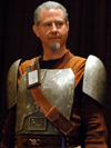
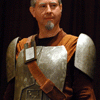
At last! Proof that your esteemed leader is in fact a REBEL!!
-
Like I said...
-
Geez Erin, it's a quarter to one in the morning! Get some sleep!
-
The Ultimate Evil; I have a Secret too
Koda Vonnor replied to The Clone Emperor's topic in Starkiller
The look, feel, and scaling of your helm is much better than the other reproduction I have seen. Well done, Maestro. I see the chest piece utilizes your hot-glue melt. Are you happy with the results it yields?