Good storytelling and gameplay go a long way, but sometimes, art direction alone makes games memorable. Their stellar sights leave a lasting impact on you. And when you can’t remember the gameplay, you always remember the view you saw in the game. It’s a heartwarming phenomenon, and one you need to feel for yourself if you haven’t already.
Dishonored’s painterly realism and Cuphead’s cartoon graphics are some of the best examples of great art styles. This list is loaded with other games as well that have just that and then some. Here are seven beautiful games with the best art styles.
1) Control
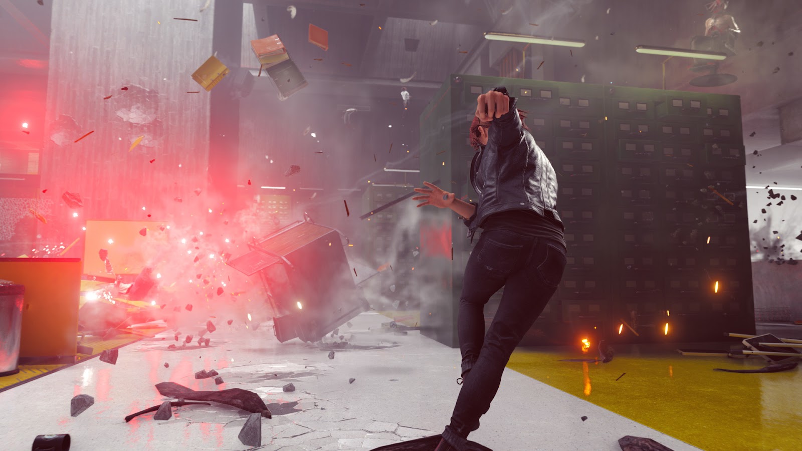
Clean and minimalistic would perfectly describe the art style of Remedy Entertainment’s Control. From the moment you set foot inside The Oldest House, you’ll notice the distinct contrast in the environment. Everything dangerous is red, the hallways are grey to symbolize an office environment, and the textures are designed not to feel messy. Even if a thousand sticky notes are flying after you’ve hurled a giant cart at an enemy, you can clearly differentiate between each individual piece. But that’s still just scratching the surface of Control’s artistic brilliance.
The setting of Control is just as unique as its narrative. The Oldest House is a series of interconnected areas that exist in a plane beyond the human world. Given that, any sort of wild area seems believable. One moment you’ll be flying through a quarry with the night sky filled with stars. Next, you’ll be in an endless hallway with hundreds of pillars. The art complements the setting and vice versa. Control is a highly aesthetic adventure, and its art direction is second to none.
2) Dishonored
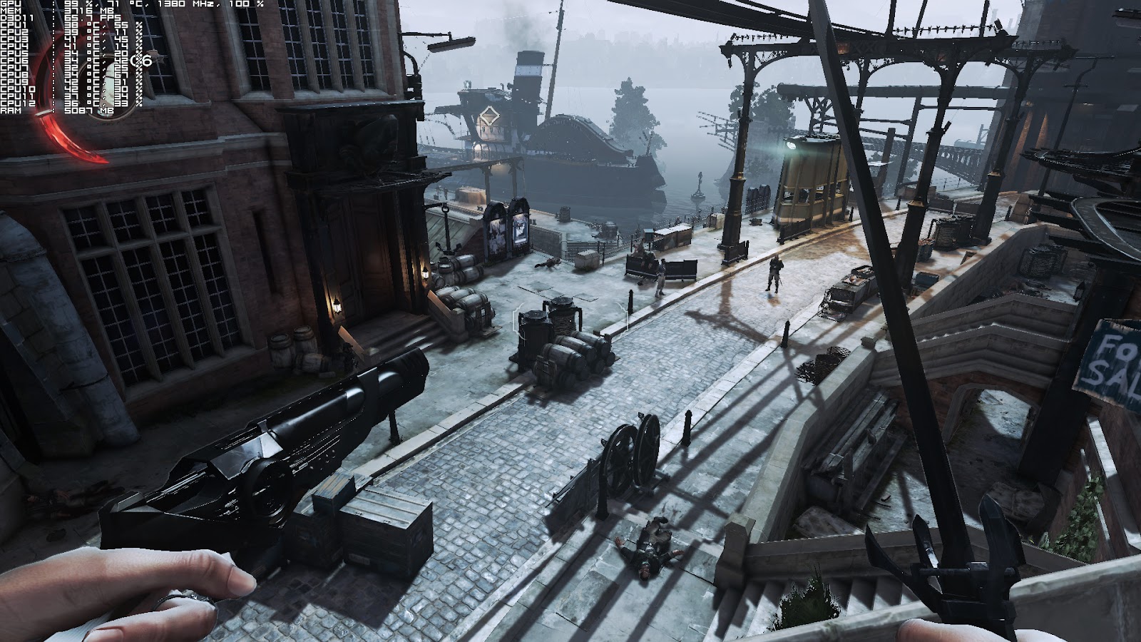
The Dishonored series is set in the late nineteenth century. It’s a fictionalized version of the Victorian Era, one where steampunk machinery and supernatural forces exist. Dishonored checks all the boxes for a good narrative setting, but the paint-inspired visuals are what make it so good.
The environment looks genuinely pleasing to the eyes. The colors are soft and put realism into the world. There’s a certain sharpness to the faces of characters. Almost like they are paintings that have come to life. The atmosphere is serious, and the world is gritty. Dishonored’s art style is slick and stylish. It’ll appeal to anyone, especially to people who dig the retro-futuristic vibe.
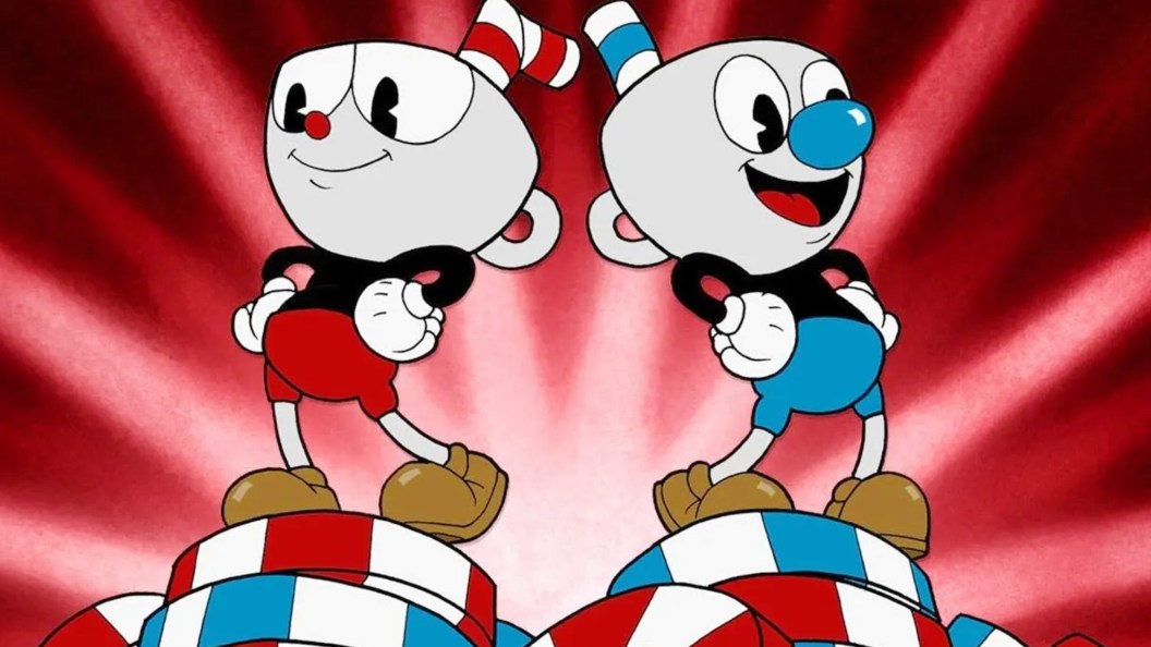
3) Cuphead
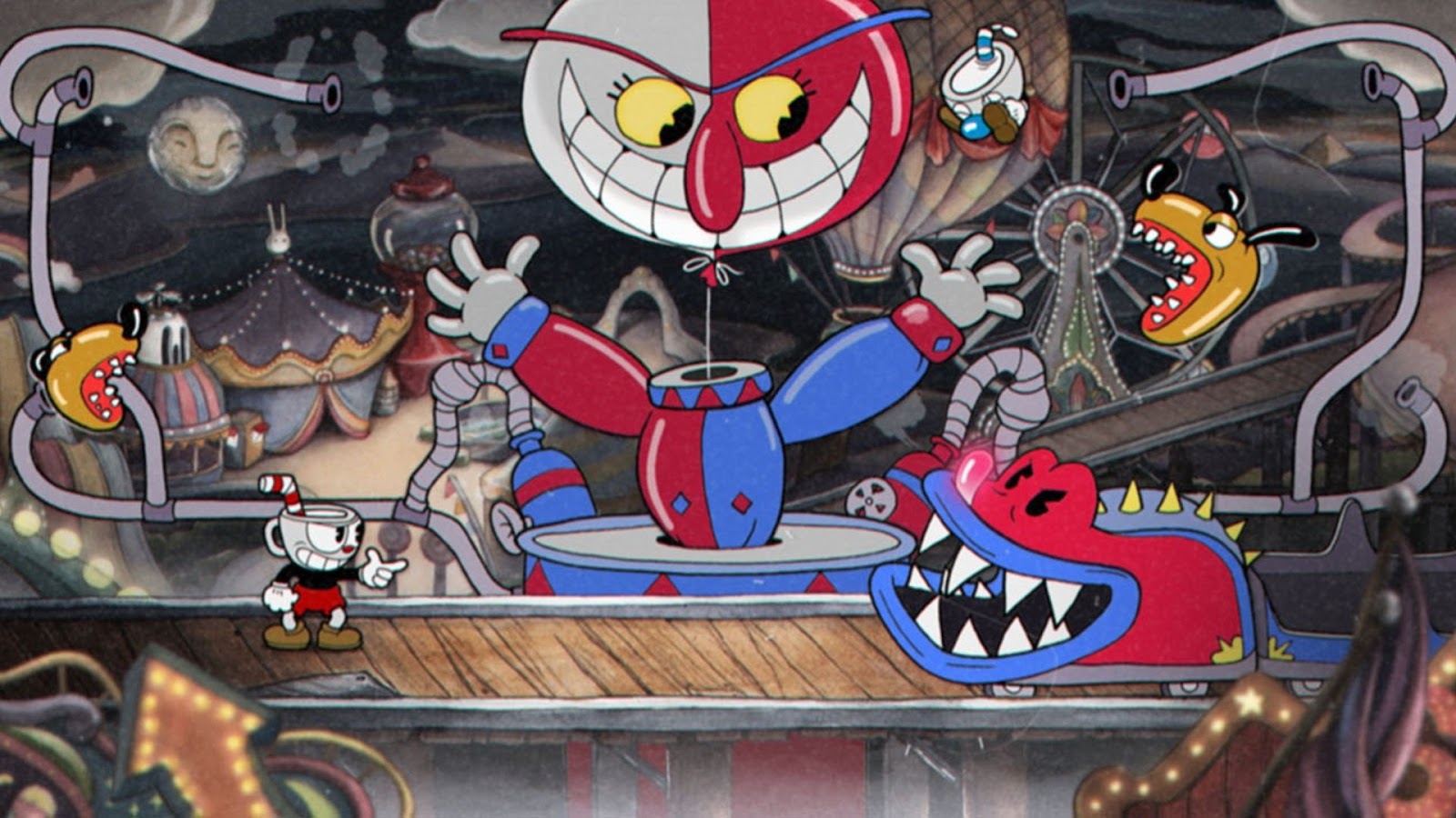
Cuphead’s visuals are retro-styled, as if the game were drawn back in the early 1930s. The art style captures the spirit of nineteenth-century cartoons. Techniques like film grain, grain flickering, and VFX for attacks are used to add more punch to the fidelity.
Backgrounds in Cuphead use watercolor and suit the rubber hose animation style well. Each encounter with NPCs is a beautiful spectacle, regardless of whether it’s a chaotic battle or a dialogue. Cuphead does an outstanding job of making you nostalgic. Its hand-drawn frames make it feel like a vintage masterpiece that deserves to be in a museum.
4) Hades
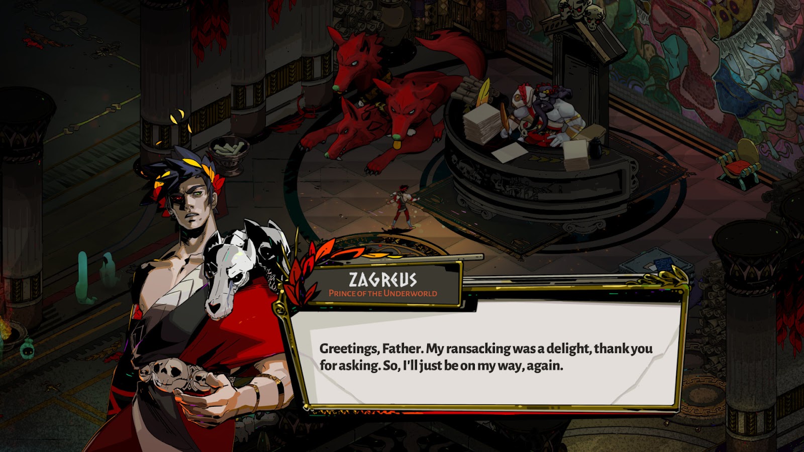
Even though Hades is an isometric perspective action game, its art is eye candy. Hades takes place across different regions, and each of them has a unique color palette and environment design. The Underworld is fiery red with scorching flames all around, while Elysium is lush green and evokes a peaceful feeling. The color palette throughout the game is diverse, and it makes each pixel pop.
However, the most gorgeous thing about Hades has to be its character design. From the eyes to the texture of the clothes, everything about the cast of Hades has been created with the utmost care. Each character looks different and has dynamic animation. The combat has stunning visual effects, and everything just works so well together. So much so that you could stand idle on the screen for hours and still not be bored.
5) Hollow Knight

Hollow Knight has a special approach to its art style. If you look closely, you’ll notice that all of Hollow Knight’s character models are minimally detailed. The models are clean and usually only have a few colors in them. Contrary to this, the environment looks super detailed.
Each region of the map follows a specific color scheme: red, green, blue, and so on. Objects are full of details and have tons of little nuances to them. But what truly makes Hollow Knight’s art style so wonderful is that it is entirely hand-drawn. Each pixel is created with intentional detail, and the overall result is cartoony visuals that are striking. Hollow Knight has amazing coherence in its art direction. It’s gothic, gritty, and dark throughout. Everything from the characters to the map regions is so well made that it proves hand-drawn art is unbeatable.
6) Rollerdrome
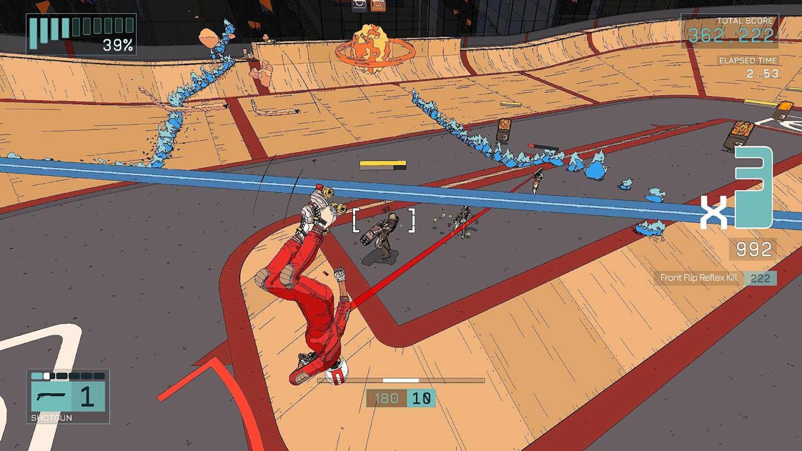
Rollerdrome is a high-octane action game. Your character skates at high speeds across the court, shooting at enemies, and performing air tricks. Because the game is so fast-paced, one of the main goals during its development was to maintain visual clarity. Roll7 accomplished that by building Rollerdrome on stylized cel-shaded visuals.
The arenas in Rollerdrome have a concise color palette. Neither too many nor too few colors are on screen. It’s always the right amount, and that not only makes the arenas look pretty but also prevents motion sickness. Objects and characters are outlined in bold, while the colors are flat, making for a stunning backdrop. The color schemes of levels are fantastic too. Even when you’re skating through them and killing enemies, you are subconsciously appreciating the art style. Lastly, Rollerdrome’s camera is cinematic. Whether you’re blazing through the arena or shooting enemies, the camera works to highlight the art style. And what results is a view so brilliant that you have to see for yourself.
7) Sable
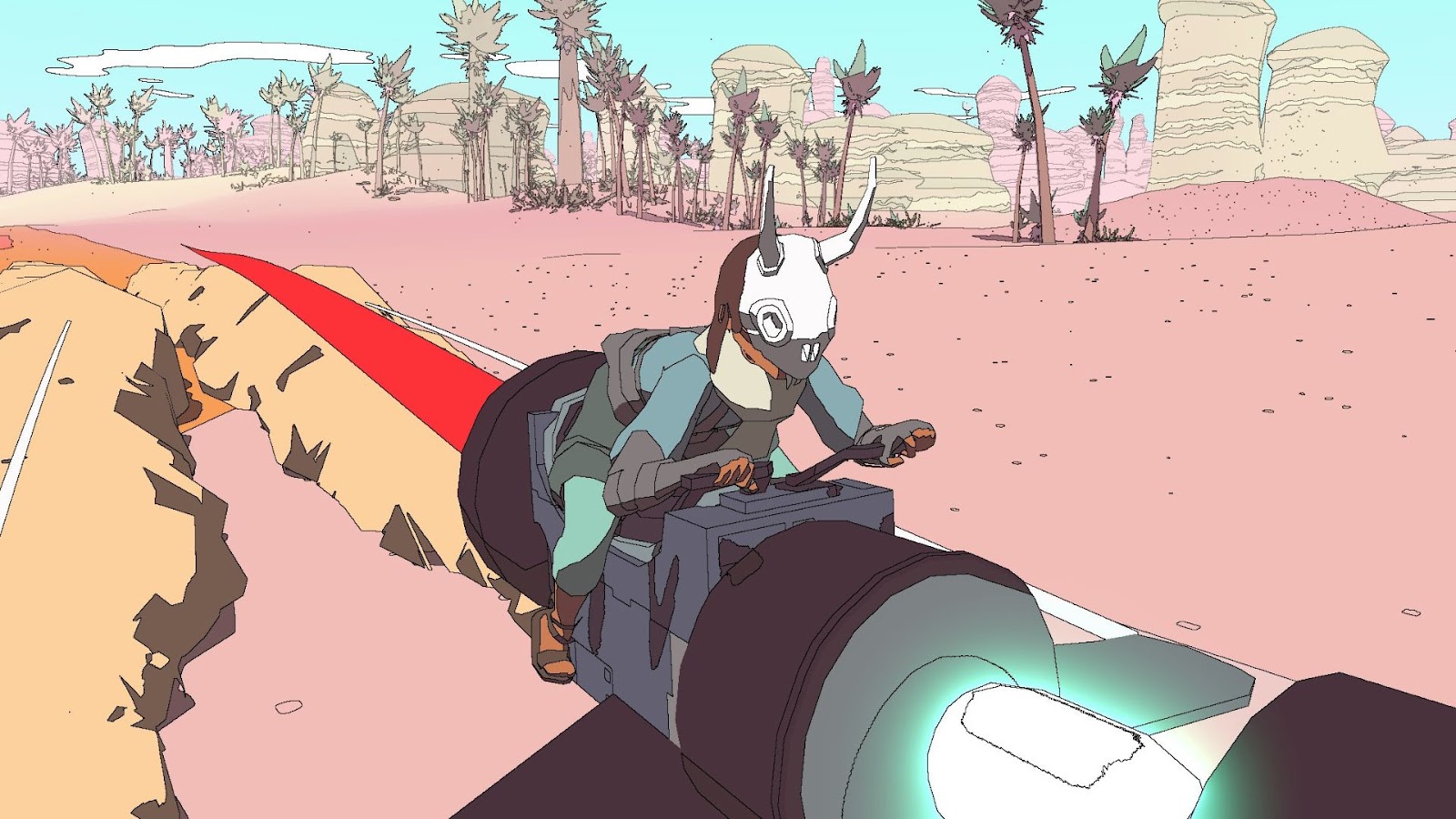
Sable’s map is gigantic, mostly consisting of deserts that players have to explore on hoverbikes. Dynamic lighting bathes the entire map during the duration of the day-night cycle. The colors used are soft, pastel-esque, and are easy on the eyes.
The textures, on the other hand, are entirely cel-shaded. Soft black outlines highlight all Items of interest minimally. Gentle colors fill in those spaces, and the result is mellow graphics that are soothing. This is topped with ambient music playing in the background. So you can imagine how wonderful it must feel to roam around on your hoverbike and then naturally discover wonders. Sable’s mostly duotone color scheme and the minimalistic take on the environment work in perfect harmony with each other. The result is a serene art style that would melt even the hardest of hearts.
The post 7 Games With the Best Art Style appeared first on ComicBook.com.